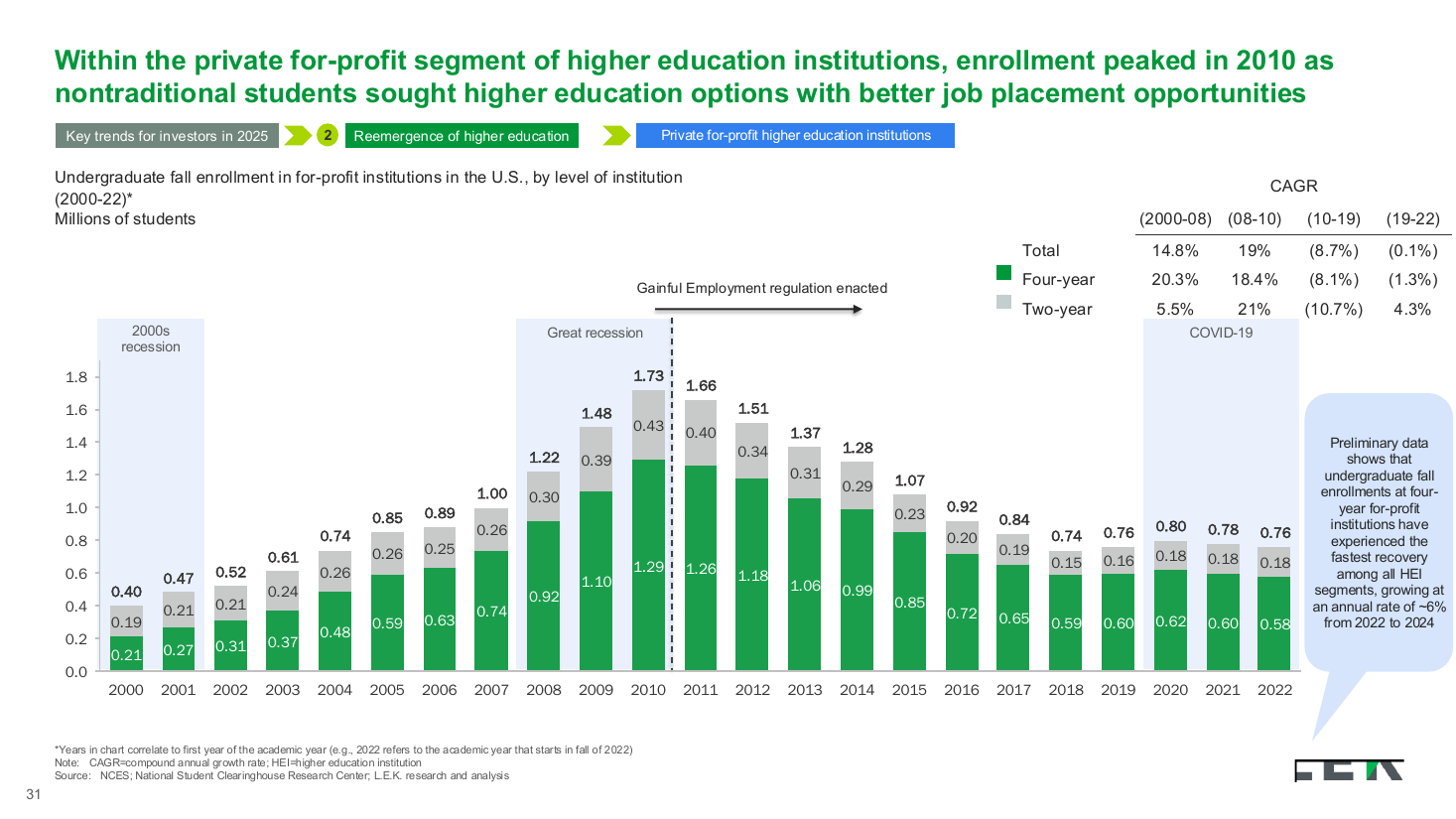
Enrollment trend stacked column with era bands slide template
A long stacked column chart of enrollment by institution level across two decades, banded by economic eras and annotated with a CAGR table. Use it to tie a long time series to macro events and phase-by-phase growth.
- Stacked columns of four-year and two-year enrollment over ~20 years
- Shaded era bands (2000s recession, Great Recession, COVID-19)
- Regulation-enacted marker on the timeline
- CAGR table split into distinct periods
Recreated as a native, fully editable PowerPoint slide from page 29 of Education M&A Roundup 2024 and Trends for 2025, a publicly published L.E.K. Consulting deck.
More like this
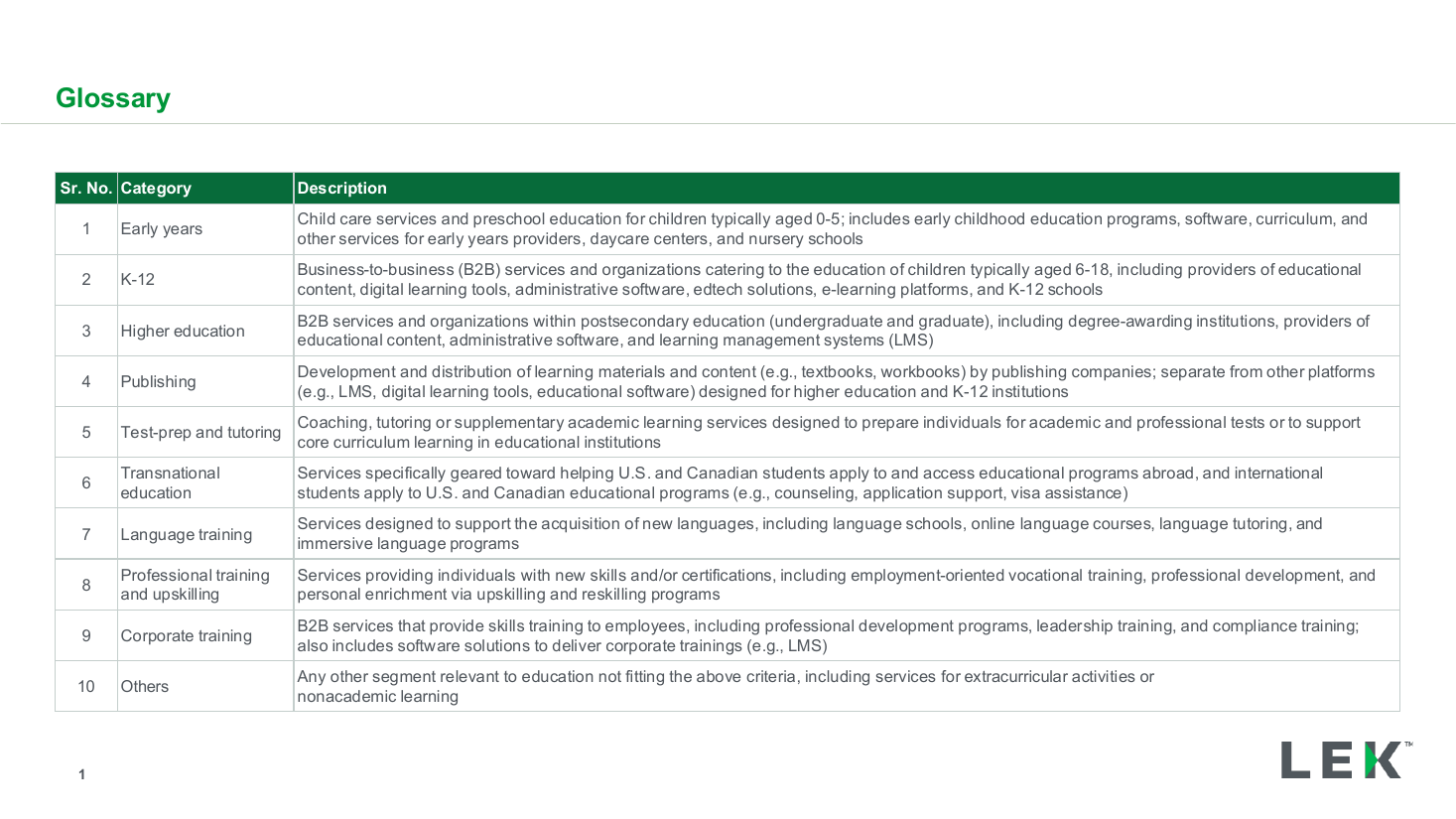
Segment glossary and category definitions table
data table
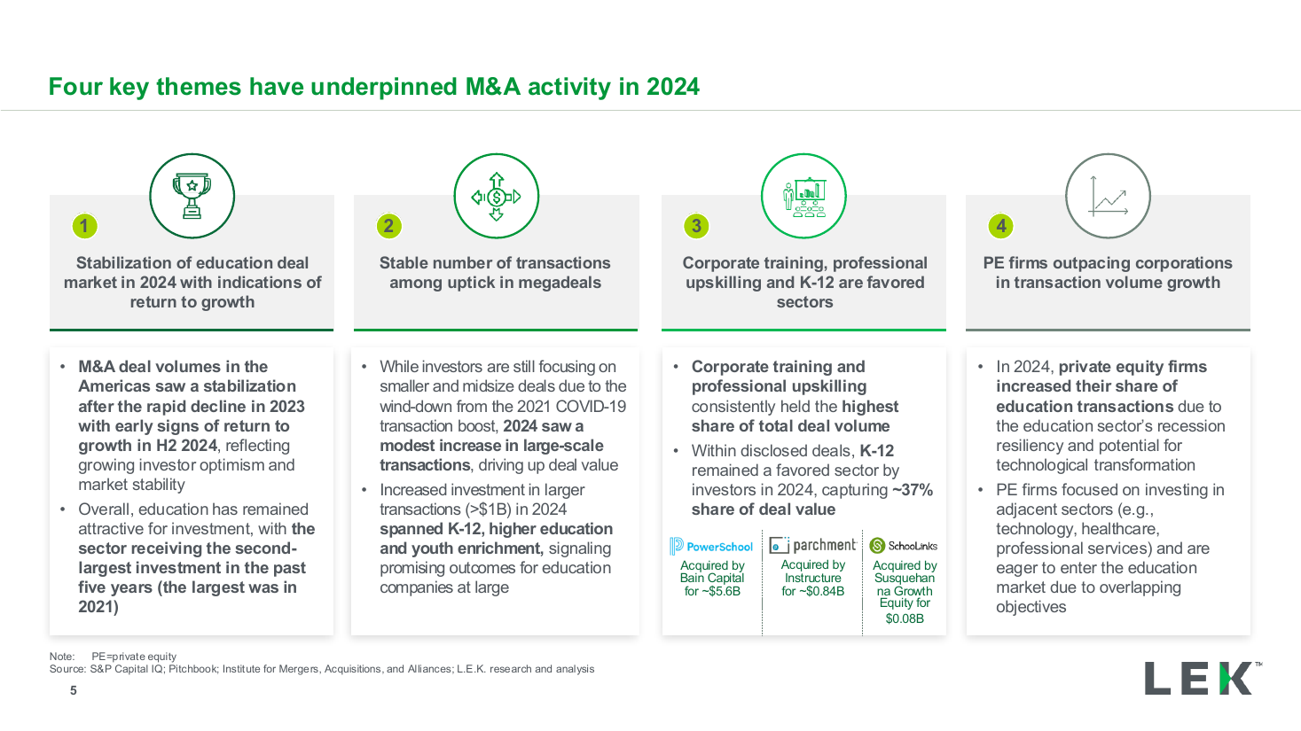
Four key themes executive summary
executive summary
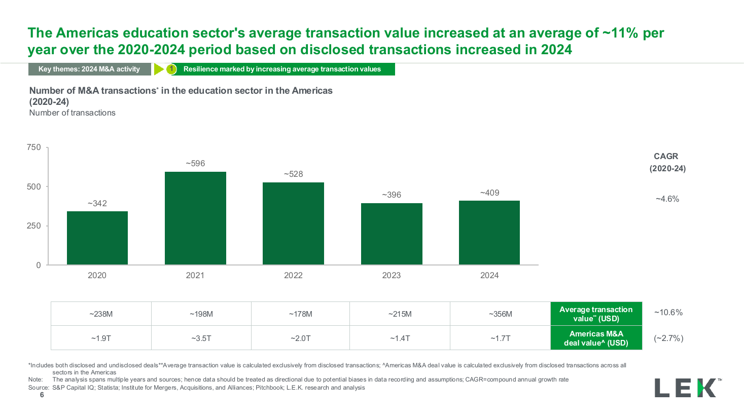
Deal volume by year column chart with CAGR
bar chart
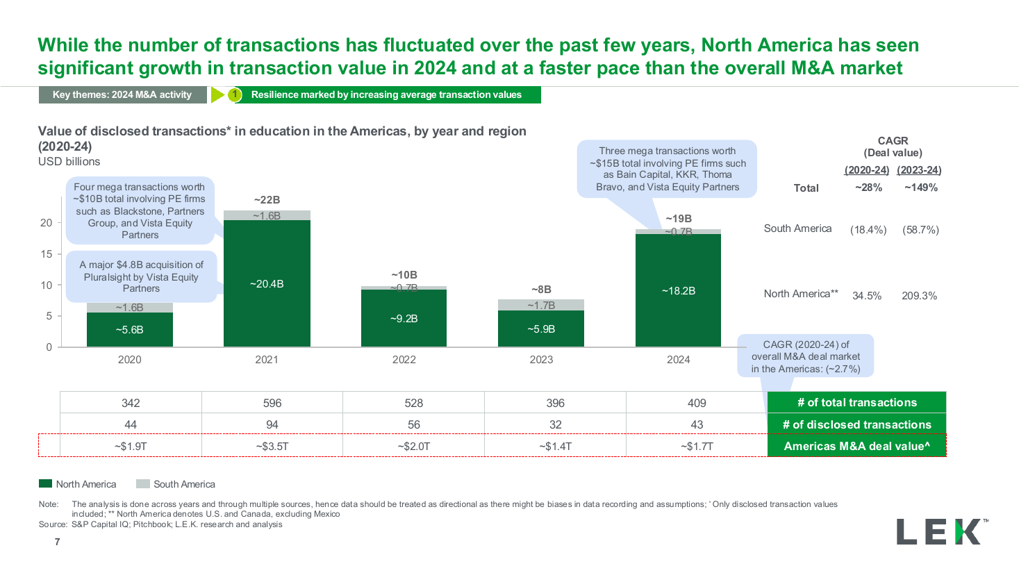
Deal value by region stacked column chart
bar chart
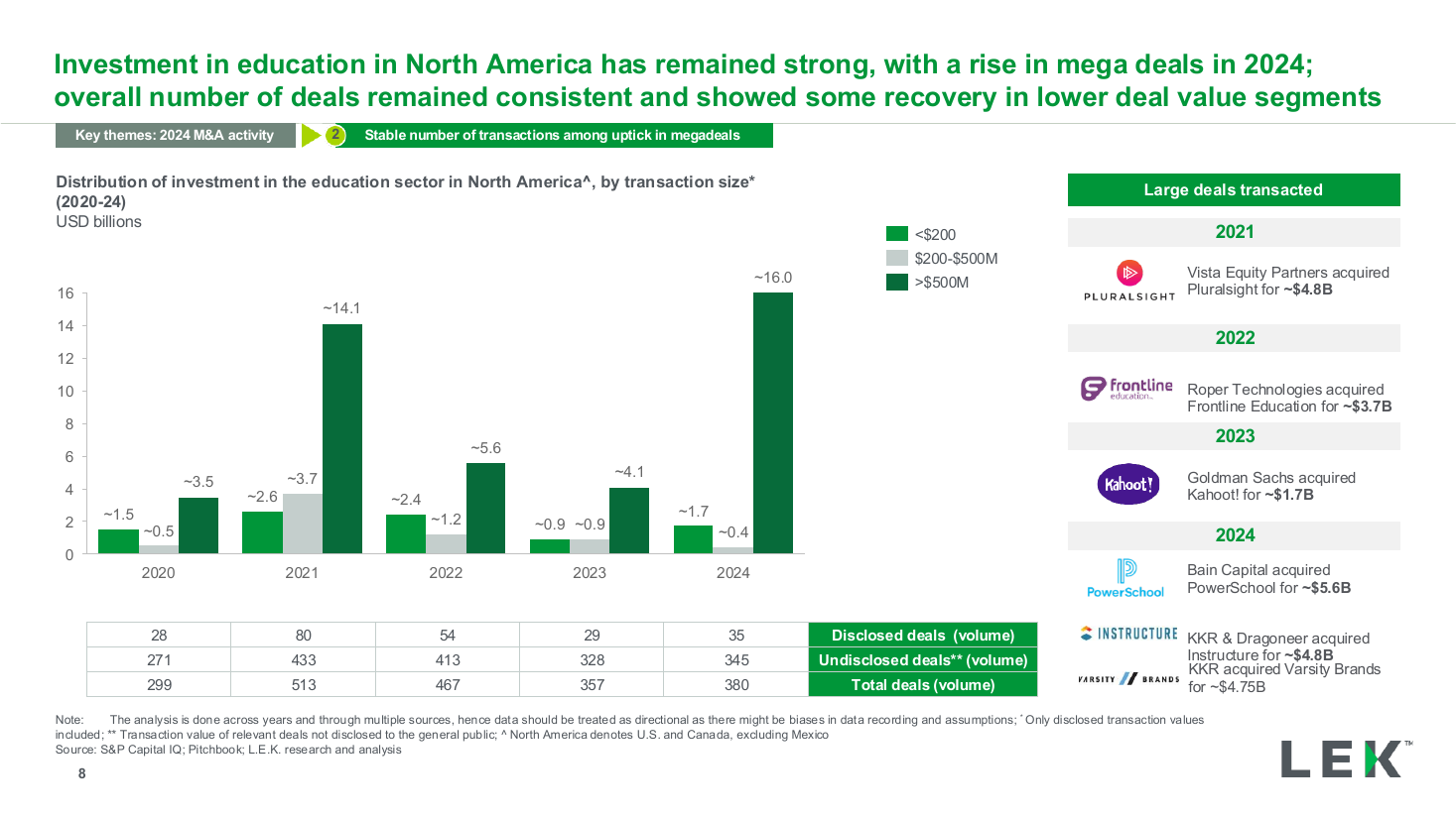
Investment by transaction size column chart
bar chart
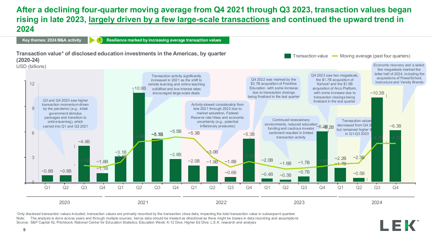
Quarterly value trend with moving average
text + chart split